SNP Tracker

Nothing to see here until you type or choose a SNP to view.

Westward Migration

notes ↓
Like North America, the population of Western Europe has been shaped by migration from the east -- but multiple times and thousands of years earlier. This chart shows longitude vs time to help visualize these migrations. The colors and thick solid/dashed lines are the same as the map, and the thin horizontal dotted lines show south-to-north lines at notable longitudes.

Note that haplogroup I precedes nearly all of the others; it can be found in the west during the Paleolithic, staying south of the glaciers of the last Ice Age.

Population Growth Rate

notes ↓
Human population growth in the Paleo- and Mesolithic eras was very slow; it took about 100,000 years for the population to double. The advent of agriculture and animal domestication in the Neolithic led to much higher rates with doubling every 800 years. In this chart, the branching of the Y or mt SNP tree is used as a surrogate for population change; growth rates are averaged over 3 SNPs along a SNP path. Because branches can be sparse these estimates are prone to considerable uncertainty. The dashed blue line shows average doubling times based on distinct growth-rate eras in the world population.

Speed of Migration

notes ↓
Since we have dates and locations for the SNP dots on the map, we can calculate the average speed of migrations. All of the usual caveats about accuracy apply, especially for anything in the last 2000 years, but the older speeds should be reasonably accurate. Note the log time scale so that you can see the whole path.

Most paths are boring: Haplogroup Q for example trudges from Africa and back to Sweden or Pakistan at a leisurely average of about 0.2 kilometers per year. Haplogroup I moves west across Europe, south of the glaciers, at the same pace. Of course no one should think of constant migration: groups probably settled down for centuries and only moved on when hunting, grazing, competition, or other forces made them move.

What I had hoped to see shows up nicely, namely the speed of nomadic cultures with horses and carts. Look at any R1b subclade and note the speed between SNPs R-L23 to R-P312, averaging about 2 km/year up the Danube valley -- ten times faster than the pace of Paleolithic tribes on foot.

Ancient DNA Samples

notes ↓
This diagram shows all of the samples with ancient DNA in this lineage. Each ancient sample is represented by two dots connected by a line: the upper dot shows the formation date of the SNP, and the lower dot shows the date (usually radiocarbon date) of a skeleton with that SNP. If the person lived at the time when the SNP first appeared, the line will be vertical and the site may be close to where the SNP arose. But highly tilted lines indicate sites where the people lived far after the SNP arose -- these can be thousands of years and thousands of kilometers from the SNP origin.

In many cases of European ancestry, the only era with ancient sites near to SNP origins is the late Neolithic to early Bronze Age, shown by a high density of near-vertical lines.

Nothing to see here until you type or choose a SNP to view.

notes
toggle date format
For SNPs in a path:
  • If you've entered multiple SNPs, only the first is shown here.
  • Click 'toggle date format' to show tMRCA (time to most recent common ancestor) or SNP formation dates, in either calendar (CE/BCE) or ybp (years before present) format. The small gray dates are the 95% confidence limits on the mean value.
  • An asterisk after a date indicates a rough estimate, since a direct tMRCA could not be calculated.
  • The number of descendants counts men who have done Y DNA testing with FTDNA.
  • The FTDNA logo is a button that will show additional information for Y SNPs.
  • The skull symbol indicates ancient DNA samples with this last known SNP. Click the skull icon for details.
  • The anchor symbol indicates a SNP with location established by the archeaology literature, not dependent on user-reported ancestry. SNPs between anchor points are interpolated assuming a constant rate of travel.
  • The pushpin symbol indicates a SNP with location manually fixed based on user-asserted ancestry, almost always a recent terminal SNP.
  • The six most prevalent countries are shown in each row for SNPs after the last anchored SNP. A weighted average of these countries determines the SNP dot location on the map.
  • The legend below the main table identifies country icons, and its bar graph shows contribution to locations, weighted by time (most recent with greatest weight).


For SNPs associated with a surname:
  • These SNPs are unrelated -- they are not a path to a single endpoint.
  • The SNPs are listed oldest-to-youngest only for convenience.
  • SNP country data is not broken out by surname, and so is shown only when all of those with the SNP have the same surname.

How to use this tool

Use the ( ) toggle button to choose Y DNA ( ) or mitochondrial (mt) DNA ().

Simply type your haplogroup (ideally your terminal SNP) into the input box and click "Go" or hit return. If this SNP is known to the FTDNA Y or mt Tree, the map will show the path from "Y Adam" or "Mitochondrial Eve" to the SNP. You need type only the lower-level code, for example "M222" instead of the full "R-M222". Y SNP names are as in FTDNA, not the older nomenclature, thus "I-L160" and not "I2a1a1" (although many short 'classic' labels will work, like R1a or G2). If what shows at the top-left of the map is different from what you typed, that's because the tool automatically searches all SNP synonyms and displays the current FTDNA nomenclature. If your haplogroup is missing, then it's not in the FTDNA Y or mt Tree. You may also select examples from the drop-down menu or tap the "shuffle" button () for a random SNP. You can compare paths by entering multiple haplogroups, separated by commas.

Hold down the option/alt key and click () for a random surname (which applies only to Y DNA).

Map Options

Once you have a path showing you can open the options menu by clicking  .

"Zoom to Europe" toggles between views of Eurasia/Africa and Europe. The camera button ( ) sends a JPG file to your Downloads folder (at least on Safari, Chrome, and Firefox; I have no way to test IE or Edge). The "Smooth Path" toggle optionally invokes an algorithm that removes much of the scatter of self-reported locations while trying to be consistent about traversal time.

"Show " will drop down a simple animation slider control. Click the play arrow to start the animation of a walking man who will trace your paternal or maternal ancestry. You can pause the animation () and then drag the slider to place the walker anywhere on your path.

"Show " and "Show Events" will show relevant ancient DNA sites and cultural or environmental patterns as the walker passes by. Details of the ancient DNA are shown in the SNP table by clicking any row's icon, and Wikipedia summaries of the events are shown at the History tab.

"Show Topography" toggles between a minimal coastline background and an topographic map. The topographic map was generously created Tom Patterson; he and his and colleagues at Natural Earth (https://www.naturalearthdata.com and http://www.shadedrelief.com) produce beautiful maps that show the earth without human labels or influence.

"Show Descendants" displays the descendants of the SNPs in your path. Within the path, arrows indicate the distance (by length) and number (by width) of the first-level branches from the SNP. For the last SNP, all SNP descendants are shown. This has no effect if your path ends in a terminal SNP, but it gives dramatic results with major ancestral SNPs such as F-M89 (ancient Mesopotamia), I-M170 (associated with Western Hunter-Gatherer), R-M417 (Eastern Hunter-Gatherer), R-L23 (Yamnaya), and I-M253 (early Scandinavian). The descendant SNP dots have the usual color code, so for example with F-M89 you can see the gradient of migration northwest over the millenia. The strong selection bias of FTDNA testers is also evident in the Finland-to-Britain dominance of locations.

What to look for

Notice how dramatically different our paths have been from Africa: Try the examples with multiple paths to England, the Isle of Man, and Finland. Your next-door neighbor's ancestors might have taken a prehistoric path thousands of miles and years different from yours.

Find long loops and round trips. Compare R1a to R1b: They're together until they get out to Mongolia and Lake Baikal, then split with R1a taking the northern route west to Europe, while R1b retraces its ancient path and weaves around the Caspian and Black Seas, finally following the Danube valley into Europe.

Look for the evidence for "starbursts" of dramatic expansion. The I1 Viking, I1 Norman, N1c Finnish, R1a Polish, and all R1b paths show a cluster of slate-blue Neolithic SNPs in close proximity: that many SNPs in the same region means that people stayed put with a fast-growing population.

The Mixed Blessing of Averages

At some point, averaging data to estimate locations simply gives silly results. A Spanish mother and German father doesn't make me French (geographically halfway). And yet there is power in numbers and averages: if a certain SNP has 10 descendants who say that they're Irish and 2 who say something else, and you have that SNP, the probability of you having Irish ancestry is significant.

For many people the Neolithic is a sweet spot: severe bottlenecks followed by strong population expansions resulted in a few very big SNPs like R-U106, R-P312, and I-M253. Descendants of these will see a fairly tight cluster of blue (Neolithic) dots in one region. High numbers lead to reasonable averages and often smooth downstream paths to Finland or Scotland.

Many Middle Eastern SNPs are a middle ground: the history of J-FGC2 is scattered from Mesopotamia to Anatolia in the Paleolithic and Neolithic, then settles down to Saudi Arabia (probably with testing bias). SNPs with lower testing levels are the most scattered: paths from T, G, and J2 tend to be poorly determined.

Also beware of the scatter associated with large countries: Russia and China get a single central location despite their huge geographic size. A single Russian descendant can pull a SNP point many hundreds of miles across Europe, even though that Russian ancestor might have lived just over the Estonian border.

Data Source and SNP Dates

This tool depends on the generosity of Family Tree DNA (FTDNA) in making their Y and mt SNP Tree data accessible. Note that there is no personal data involved (no kit numbers), only the structure of the tree and self-reported ancestor locations. Since August 2022, FTDNA has provided excellent SNP dates based on both SNP and STR data https://discover.familytreedna.com https://blog.familytreedna.com/tmrca-age-estimates-update/ ; these are far more accurate than previous values.

The sketch illustrates the difference between tMRCA (time to most recent common ancestor) and formation dates. A SNP is a mutation that occurs at a certain time and place. At some point afterwards, a person with that SNP will have two or more children each with modern descendants who have done DNA testing. From those DNA tests we can infer the time to that branch-point; this is the SNP's tMRCA. In a rapidly expanding population with many surviving lineages, tMRCA and formation are very close and may be identical. But for older and leaner lineages, a SNP may appear long before one of the originator's descendants has two surviving lineages, and additional separate mutations may occur in that time. In the sketch, SNP S2 is one of 21 such equivalents: different mutations but evidently from a long unbranched line, since all DNA testers either have none of these 21 SNPs or they have all of them. The tMRCA for S2 is shown in blue; it's where branches that have S3 and S4 split away. But the formation time for S2 cannot be directly measured and it could be anywhere between S2's tMRCA and the previous tMRCA. YFull's convention is to assign a SNP's formation date to the previous SNP'S tMRCA (the left-most of the long run of equivalent SNPs). But it is perhaps better to estimate the formation date as halfway between, as shown by the red dot, which is what SNP Tracker does.

SNP dates for mtDNA are interpolated from a subset of SNPs at YFull https://www.yfull.com/mtree/ with tMRCAs estimated by the method of Adamov et al. https://www.academia.edu/download/66428944/Defining_a_New_Rate_Constant_for_Y-Chrom20210421-26793-16hns1i.pdf

Self-Reported and Historic Locations

Map locations are intended to show where a given SNP mutation occurred, not where a haplogroup may be most prevalent today. Locations are estimated with a combination of (1) averages of FTDNA testers' reported ancestry for over 20,000 Y or 5400 mt SNPs, and (2) about 150 specific SNPs that I have anchored based on academic scholarship. These sources are complementary: paleolithic dates are very poorly estimated by modern testers' history but a small number of academically-located paleolithic SNPs suffice for the most populous branches. On the other hand, averages of modern reported ancestry are often quite good for medieval to modern localization.

Wikipedia and its references are a major source for academic SNP locations. The Indo-European project https://indo-european.eu/ and Eupedia https://www.eupedia.com/europe/neolithic_europe_map.shtml are also excellent sources with maps, references, and detailed discussion. Most migration maps (for example https://upload.wikimedia.org/wikipedia/commons/8/8c/Migraciones_humanas_en_haplogrupos_de_ADN-Y.PNG , https://natgeoeducationblog.files.wordpress.com/2015/12/world_map_of_y-dna_haplogroups.png ) are too general to be useful in locating specific SNP origins in time and location, though for mtDNA there is not much more (see below).

Carlos Quiles recently shared his hand-curated list of over 8700 ancient human remains with locations, dates, and Y and/or mtDNA haplogroups. But even with this trove of data and five different approaches, automated methods relying solely on ancient sites are no match for human interpretation. See http://scaledinnovation.com/gg/gg.html?rr=ancientSites for details.

I hand-curated a few anchored points where the given locations would have required a very unusual rate of migration. It is also worth noting that a number of published ancestral tracks are probably incorrect because they do not fully account for the time-sequence of SNPs. Every path on this map is drawn by traversal of the Y or mt SNP tree and thus always in correct past-to-present order.

Personalized Terminal SNPs

As more men do BigY DNA testing the Y SNP tree has grown to the point where many terminal SNPs now overlap the timescale of paper genealogy; this allows those testers to pinpoint the precise origin of that SNP in time and geography. SNP Tracker identifies these SNPs and fixes those that have a single country location. In addition, I will add more specific data if asked. Use the button below to email me your SNP name, surname, SNP formation date, and origin latitude and longitude in decimal degrees, not degrees/minutes/seconds; west longitude is negative. Note that only European or Asian locations will show on the map, so even if your terminal SNP is actually in North America, give me the last known European location. Only BigY terminal SNPs please: I will not modify any SNP with more than one surname attached, or any earlier than about 1800 CE. I generally do data updates every 4-6 weeks.

Ask for Custom SNP Data

Ancient Global Consistency and Recent Smoothing

Since November 2019 ancient SNP paths are computed as a whole, taking account of their interdependencies, and recent paths may be optionally anchored to very recent terminal SNPs that cite a single ancestral country. The latter change recognizes the increase in BigY data which means that many customers' terminal SNPs now extend (in time and geography) into the range of paper genealogy. See the Research Report http://scaledinnovation.com/gg/gg.html?rr=pathFix for details.

Mitochondrial DNA
Ancestral paths for mtDNA are much more difficult to estimate than for Y DNA: mtDNA mutations are fewer and rarer (one per ~10,000 years, vs one per ~100 years for Y SNPs or Y STRs). mtDNA is much more diverse since maternal lines have not had the purifying effect of major bottlenecks (near-extinctions) like Y DNA, thus mtDNA does not have easily traced "migration superhighways" like Y DNA (i.e. R1b-M269, R1a-M198, I1-M253). As a result, many mtDNA lineages tend to be ancient and found across all of Eurasia. The literature offers less information about founders and splitting, so the mtDNA paths here are largely based on continent-scale general migration maps such as https://en.wikipedia.org/wiki/File:Human_migrations_and_mitochondrial_haplogroups.PNG and to a lesser extent https://www.familytreedna.com/learn/wp-content/uploads/2015/12/mt_Map_12_17_2015.png .
Ancient DNA

SNP Tracker can display 14,000 ancient samples with Y and/or mtDNA, but to reduce visual clutter and confusion, only those that apply to a given SNP are shown, and then only when the "walking man" reaches the time period when that ancient person lived. Pause the animation and drag the slider manually to see the skull icons appear and fade under your control.

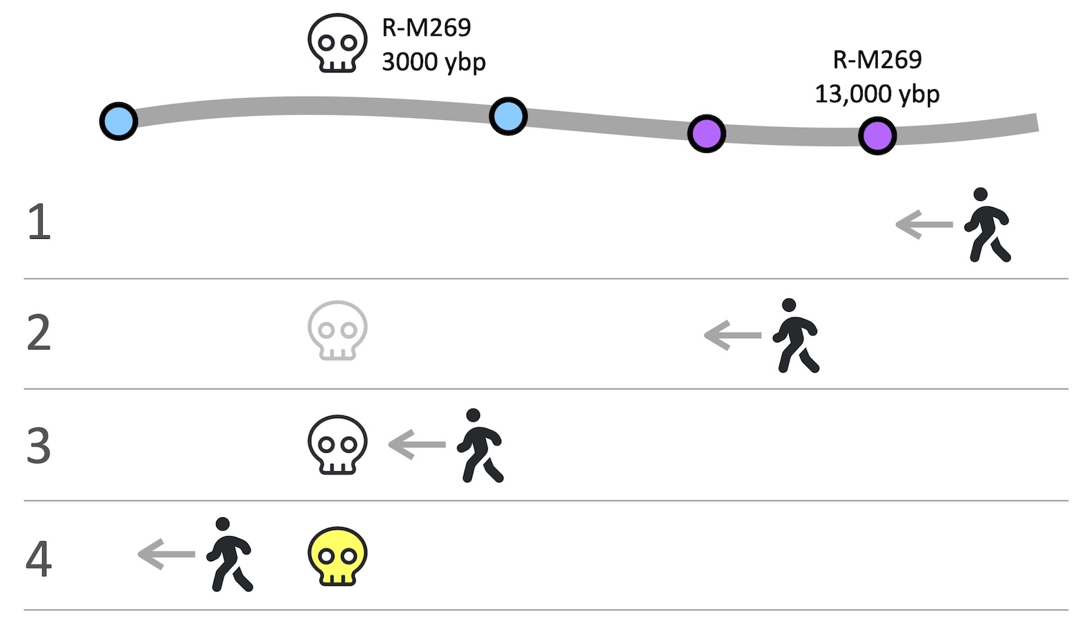
The skull icon denoting an ancient site will change appearance as the walking icon moves. The cartoon shows a site with SNP R-M269 and date 3000 years before present, while SNP R-M269 was formed 13,000 ybp and is much farther east. Before the walker gets to R-M269 (1) the skull doesn't appear -- it couldn't have existed yet. Once the walker passes M269 (2) the skull appears but faintly because of the large time discrepancy. As the walker gets close to the date of the skeleton (3), the skull gets darker, and as the walker proceeds past the time of the skeleton (4) the icon becomes yellow, as if the bones are aging.

All data are from Carlos Quiles' compilation spreadsheets which are available at his website https://indo-european.eu/ancient-dna/. Click any skull icon in the SNPs table to give details of individual samples. The Ancient DNA Samples diagram under the Timelines tab shows that many ancient samples are very far in time and space from when and where their last recorded SNP arose; this is one of many reasons why ancient DNA alone is insufficient to determine SNP paths http://scaledinnovation.com/gg/gg.html?rr=ancientSites. One of the major reasons for the time discrepancy is that many ancient remains were tagged by a characteristic SNP (such as R1, I1a, or R-M269) based on a PCR or STR test, rather than by more recently available BigY or other sequencing tests that would determine the true terminal SNP.

Also note that any ancient skeleton is very unlikely to be a direct ancestor, but rather a person who split from your lineage at the point where the shared SNP arose.

Why such poor coverage for Africa, India, China, Oceania, and Native Americans?
The tools depend on location and phylogenetic data from FTDNA testers, which is currently too limited for these locations. The majority of FTDNA testers are Americans of European ancestry.
Caveats, questions, comments, requests

This tool is entirely free and it comes with no guarantees. I have tried to make the maps as accurate as possible, but the more recent points on any path will depend on self-reported countries of ancestry. They will change as new data arrive. If and when FTDNA adds dates to their Y Tree data, I will adopt those since they're likely to be more accurate than my method of interpolation from YFull.

If you think that I got something wrong, particularly in paleolithic locations, please let me know; if you include research and references to back up your assertion, then I will modify the paths. Remember that I cannot control recent (post-Roman) locations because they're based on FTDNA user data.

Please tell me about your ideas for improvement and stories where this tool has been of particular interest to you.

Rob Spencer    
Contact Me

Choose "Show " under the Map Options menu ( ), and a walking man icon will traverse the path of your paternal or maternal ancestors. Selected major events and cultures appear as it passes by; thanks to Wikipedia this page has notes on each. The haplogroup buttons below show example SNPs which first appeared at the same time and place as each event or culture -- but note that haplogroups are not exclusive: all cultures were mixtures.
Loading Data